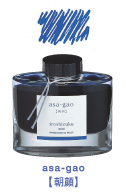
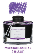
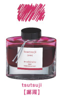
Introducing Iroshizuku bottled ink for Namiki and Pilot fountain pens. The name “Iroshizuku” is a combination of the Japanese words “Iro (Coloring),” expressing high standards and variation of colors, and “Shizuku (Droplet),” that embodies the very image of dripping water.
Retail Price: $35.00
Enjoy Japan’s rich and subtle color aesthetic as you write in a choice of 17 ink colors:
Morning Glory (asa-gao)
Hydrangea (ajisai)
Asiatic Dayflower (suyu-kusa)
Deep Cerulean Blue (kon-peki)
Moonlight (suki-yo)
Peacock (ku-jaku)
Dew on Pine Tree (syo-ro)
Forest Green (shin-ryoku)
Autumn Shower (kiri-same)
Old Man Winter (fuyu-syogun)
Crimson Glory Vine (yama-budo)
Azalea (tsutsuji)
Autumn Leaves (momiji)
Sunset (yu-yake)
Winter Persimmon (fuyu-gaki)
Horsetail (tsukushi)
Wild Chestnut (yama-guri)
Each Iroshizuku bottled ink name derives from the expressions of beautiful Japanese natural landscapes and plants, all of which contribute to the depth of each individual color:
Morning Glory – a refreshing blue hue like a newly blooming morning glory.
Hydrangea – this shade of blue is reminiscent of the image of raindrops nestling on its petals.
Asiatic Dayflower – a blue similar to a small, fragile Asiatic dayflower.
Deep Cerulean Blue - expresses the color of a vast and clear summer sky.
Moonlight – a blue shade like the night sky, dimly illuminated by moonlight.
Peacock – a green color which evokes visions of the stark and vivid feathers of the richly multicolored peacock.
Dew on Pine – a green shade similar to a dewdrop reflecting pine needles.
Forest Green – embodies the unchanging color of a dense evergreen forest in a long winter.
Autumn Shower – a grey shade like a landscape expectant of winter.
Old Man Winter – a grey conjuring up the image of the cold, clear air of the severe winter season.
Crimson Glory Vine – this red embodies the bright and ripe fruit of the wild, yet subdued crimson glory vine.
Azalea – a red hue like the common red amongst the myriad hues of the Azalea flowers.
Autumn Leaves – a red shade emulating the bright red leaves that are iconic of a Japanese autumn.
Sunset – an orange hue like sky, painted by the evening sunset on clear day.
Winter Persimmon - an orange similar to the shade of a lusciously ripe persimmon.
Horsetail – a soft brown like a young horsetail awaiting the coming of spring.
Wild Chestnut – a brown color similar to the image of a ripe, fallen chestnut shell during the longing season of autumn.


日本 Pilot 百樂彩色墨水系列,顏色的名字取得真美:
朝顏、紺碧、露草、紫陽花、月夜、松露、深綠、孔雀、紅葉、冬柿、夕燒、躑躅、山葡萄、霧雨、冬將軍、山栗、土筆 共十七色。
一樣為漢字,日本與中國的形容與應用差很多.
ラインアップ
万年筆インキ iroshizuku
INK-50-AS アサガオ(AS) | INK-50-AJ アジサイ(AJ) | INK-50-TS ツユクサ(TS) |
INK-50-KO コンペキ(KO) | INK-50-AMA アマイロ(AMA) | INK-50-TY ツキヨ(TY) |
INK-50-SNK シンカイ(SNK) | INK-50-KJ クジャク(KJ) | INK-50-SHR シンリョク(SHR) |
INK-50-SY ショウロ(SY) | INK-50-CHK チクリン(CHK) | INK-50-FS フユショウグン(FS) |
INK-50-KS キリサメ(KS) | INK-50-TAK タケスミ(TAK) | INK-50-YB ヤマブドウ(YB) |
INK-50-MS ムラサキシキブ(MS) | INK-50-TT ツツジ(TT) | INK-50-MO モミジ(MO) |
INK-50-FG フユガキ(FG) | INK-50-YU ユウヤケ(YU) | INK-50-KM コスモス(KM) |
INK-50-IH イナホ(IH) | INK-50-TK ツクシ(TK) | INK-50-YG ヤマグリ(YG) |
http://ebooks.adelaide.edu.au/o/orwell/george/o79b/chapter1.html
Burmese Days, by George Orwell
Chapter 1
‘This desert inaccessible
Under the shade of melancholy boughs’
Under the shade of melancholy boughs’
As you like it.
U Po Kyin, Sub-divisional Magistrate of Kyauktada, in Upper Burma, was sitting in his veranda. It was only half past eight, but the month was April, and there was a closeness in the air, a threat of the long, stifling midday hours. Occasional faint breaths of wind, seeming cool by contrast, stirred the newly drenched orchids that hung from the eaves. Beyond the orchids one could see the dusty, curved trunk of a palm tree, and then the blazing ultramarine sky. Up in the zenith, so high that it dazzled one to look at them, a few vultures circled without the quiver of a wing.
In Myanmar, Valuing an Isolated Orwellian Link /Burmese Days (George Orwell) In Myanmar, Valuing an Isolated Orwellian Link /Bu...
| 藍色系 | |||||||||||||
|---|---|---|---|---|---|---|---|---|---|---|---|---|---|
| 愛麗絲藍 | 天藍色 | 藍色 | 蔚藍色 | 天青藍 | 鈷藍色 | 矢車菊藍 | 深藍色 | 丹寧布色 | 道奇藍 | 靛青色 | 國際奇連藍 | ||
| 薰衣草色 | 午夜藍 | 海軍藍 | 長春花色 | 波斯藍 | 粉末藍 | 普魯士藍 | 皇室藍 | 青玉色 | 鋼青色 | 群青色 | 淺藍色 | ||
エッフェル塔、青く変身
2カ月間続く
 |
| 2008.6月30日、欧州連合(EU)旗の色に合わせて青くライトアップされたパリのエッフェル塔(UPI=共同) |
紺地に12の黄色い星を配した欧州連合(EU)旗をモチーフにした照明。フランスが7月からEUの議長国になるのに合わせ、普段はオレンジ色に浮かび上がるエッフェル塔が“
Images for eu flag
- Report images值得一讀:胡適日記全集, 第 3 卷 1921-22
1921.7.25 編中文的《顏色的故事》參考書之好資料。
Blue Through the Centuries: Sacred and Sought After
October 29, 2012
However inspired they may have been by the immaculate beauty of the sky and water they saw every day, prehistoric artists had no way to render the color blue with paint. As Heinz Berke of the University of Zurich has pointed out, the famous cave paintings at Lascaux and surrounding sites, which date back some 20,000 years, are notably lacking in blue.
“Early mankind had no access to blue, because blue is not what you call an earth color,” said Dr. Berke, a chemist who has studied the history of blue pigment. “You don’t find it in the soil.” Only with the advent of mining, he said, could sources of blue pigment be extracted.
The first stable blue colorant used in the ancient world came from lapis lazuli, a semiprecious stone mined in Afghanistan beginning about 6,000 years ago. The Egyptians prized all things lapis, combining it with gold to adorn the tombs of the pharaohs, or powdering it into eye shadow for Cleopatra.
But the scarcity of the mineral drove the Egyptians to seek new blues through chemistry. By heating together limestone, sand and copper into the chemical compound calcium copper silicate, they invented the richly saturated royal-turquoise pigment called Egyptian blue. Variants of the recipe were taken up by the Mesopotamians, the Persians, the Greeks and the Romans, who built factories devoted to blue’s production.
In ancient China, chemists created blue pigments by blending copper with heavy elements like barium, lead and mercury. Unfortunately, those same heavy elements were often brewed into popular — and ultimately toxic — elixirs. “It’s said that 40 percent of the Chinese emperors suffered from heavy-element poisoning,” Dr. Berke said.
The Mesoamericans invented the third of the three great blues of ancient civilization, a vivid and durable pigment called Mayan blue that scientists recently suggested could be a mix of indigo plant extract, a clay mineral called palygorskite, and resin from the Maya’s sacred incense, copal.
Whatever its origin, the blue pigment remained rare and expensive until the dawn of the industrial age, which probably explains blue’s longstanding association with royalty and divinity, and possibly why it is a widely favored color today. According to Steven Bleicher, a professor of visual arts at Coastal Carolina University, blue got a big endorsement in the year 431, when the Catholic church decided to “color code” the saints.
“Mary was given a blue robe,” he said, “a dark, wonderful and expensive blue befitting the queen of heaven.”
Over time, Mary blue became navy blue, the color of trustworthiness and authority, of bankers and the police. At this point, navy blue is so tightly linked to the notions of authority, Dr. Bleicher said, that the United Nations specifically avoided the color in designing the uniform of its peacekeeping troops and instead opted for a softer robin’s-egg blue.
As for the color-coding of the sexes, the idea that blue is for boys and pink means girls didn’t really gain traction in this country until the postwar baby boom, according to Jo B. Paoletti, a historian of dress at of the University of Maryland and the author of the new book “Pink and Blue: Telling the Boys From the Girls in America.” Even then, some parts of the South lagged in adopting the strict rules of childhood attire. “I found examples of pink clothing for boys way up through the 1970s,” Dr. Paoletti said.
So, too, should we recall in today’s bitter blue-red, donkey-pachyderm dialectic that just a few years ago, red stood for Marx.
藍色曾經是一種尊貴的顏色
報道2012年10月29日

Anne Rippy/Getty Images
端莊的孔雀總是和藍色聯繫在一起。
無論天空、水面的無瑕之美曾給史前藝術家們帶來多少靈感,他們也無法將藍色再現於畫布。 蘇黎世大學(University of Zurich)的海因茨·貝爾克(Heinz Berke)指出,知名的拉斯科(Lascaux)洞窟及其附近洞窟內2萬年前的壁畫看不到任何藍色。
貝爾克博士說,“早期人類接觸不到藍色顏料,因為這不是一種所謂的土地色。你無法從泥土中提取。”他說,只有人類開始礦產開發後,才開始提取藍色顏料。貝爾克博士是化學家,他對藍色的歷史進行了研究。
但這種礦物質極其稀有,於是埃及人只能通過化學手段提取新的藍色。他們將石灰石、沙子、銅加熱形成化合物鈣銅硅酸鹽(calcium copper silicate),他們發明了飽滿的呈王室綠松石色澤的顏料——埃及藍。隨後,美索不達米亞人、波斯人、希臘人和羅馬人分別採納了這個配方的不同版本, 他們建了工廠專門製作藍色。
在古代中國,化學家們將銅與重金屬鋇、鉛或水銀化合,創造出一種藍色。但可惜的是,這些同樣的重金屬也用來煉製當時盛行的,但實則有毒的長生不老葯。貝爾克博士說,“據說40%的中國皇帝都重金屬中毒。”
然後,美洲土著發明了一種鮮艷的、色澤持久的顏料叫瑪雅藍。這是古文明創造的三種偉大藍色的第三種。科學家們近來指出,瑪雅藍可能混合了槐藍屬植物提取物,粘土礦物坡縷石以及瑪雅人奉為聖香的柯巴脂。
不論其來源,在工業時期以前,藍顏料始終稀少、昂貴。這也許能說明為什麼藍色始終與皇室和神關聯,而且藍色至今為人們所喜愛。卡羅來納海岸大學 (Coastal Carolina University)的視覺藝術教授史蒂文·布萊謝爾(Steven Bleicher)發現,公元431年,當天主教會決定以不同的顏色代表各聖徒,藍色的地位進一步鞏固。
他說,“馬利亞穿上了藍色的袍子,這種深沉、美麗、奢華的藍色正符合聖母的形象。”
布萊謝爾博士說,後來馬利亞藍成了海軍藍,一種代表信任、權威的顏色,也成了銀行家和警察的顏色。此時,藍色和權威已經緊緊聯繫起來。聯合國在設計維和士兵制服的時候有意避開始用這種顏色,而選擇了更為柔和的知更鳥蛋殼藍。
馬里蘭大學(University of Maryland)研究服裝史的喬·B·保萊蒂(Jo B. Paoletti)說,至於用顏色來標識性別——藍色代表男孩,粉色代表女孩,也是在戰後嬰兒潮時才開始使用。保萊蒂寫了《粉和藍:在美國辨別男孩、女 孩》(Pink and Blue: Telling the Boys From the Girls in America)。即使在那時,美國南部的一些地區仍沒有採用嚴格的兒童服飾規則。保萊蒂博士說,“我發現直到上世紀70年代末,仍有男孩穿粉色服裝。”
那麼,我們是不是應該忘記當下的非藍即紅,非驢即象的邏輯。要知道,不久以前,紅色代表馬克思主義。
貝爾克博士說,“早期人類接觸不到藍色顏料,因為這不是一種所謂的土地色。你無法從泥土中提取。”他說,只有人類開始礦產開發後,才開始提取藍色顏料。貝爾克博士是化學家,他對藍色的歷史進行了研究。
古代世界第一個着色穩定的藍顏料取自於青金石。這是一種產自阿富汗的次等寶石,大約於6000年(前?)開始開採。埃及人給予這種藍寶石無上的地位。他們用青金石加金子來裝飾法老的墓穴,女王克麗奧佩特拉(Cleopatra)用它的粉末做眼影。
但這種礦物質極其稀有,於是埃及人只能通過化學手段提取新的藍色。他們將石灰石、沙子、銅加熱形成化合物鈣銅硅酸鹽(calcium copper silicate),他們發明了飽滿的呈王室綠松石色澤的顏料——埃及藍。隨後,美索不達米亞人、波斯人、希臘人和羅馬人分別採納了這個配方的不同版本, 他們建了工廠專門製作藍色。
在古代中國,化學家們將銅與重金屬鋇、鉛或水銀化合,創造出一種藍色。但可惜的是,這些同樣的重金屬也用來煉製當時盛行的,但實則有毒的長生不老葯。貝爾克博士說,“據說40%的中國皇帝都重金屬中毒。”
然後,美洲土著發明了一種鮮艷的、色澤持久的顏料叫瑪雅藍。這是古文明創造的三種偉大藍色的第三種。科學家們近來指出,瑪雅藍可能混合了槐藍屬植物提取物,粘土礦物坡縷石以及瑪雅人奉為聖香的柯巴脂。
不論其來源,在工業時期以前,藍顏料始終稀少、昂貴。這也許能說明為什麼藍色始終與皇室和神關聯,而且藍色至今為人們所喜愛。卡羅來納海岸大學 (Coastal Carolina University)的視覺藝術教授史蒂文·布萊謝爾(Steven Bleicher)發現,公元431年,當天主教會決定以不同的顏色代表各聖徒,藍色的地位進一步鞏固。
他說,“馬利亞穿上了藍色的袍子,這種深沉、美麗、奢華的藍色正符合聖母的形象。”
布萊謝爾博士說,後來馬利亞藍成了海軍藍,一種代表信任、權威的顏色,也成了銀行家和警察的顏色。此時,藍色和權威已經緊緊聯繫起來。聯合國在設計維和士兵制服的時候有意避開始用這種顏色,而選擇了更為柔和的知更鳥蛋殼藍。
馬里蘭大學(University of Maryland)研究服裝史的喬·B·保萊蒂(Jo B. Paoletti)說,至於用顏色來標識性別——藍色代表男孩,粉色代表女孩,也是在戰後嬰兒潮時才開始使用。保萊蒂寫了《粉和藍:在美國辨別男孩、女 孩》(Pink and Blue: Telling the Boys From the Girls in America)。即使在那時,美國南部的一些地區仍沒有採用嚴格的兒童服飾規則。保萊蒂博士說,“我發現直到上世紀70年代末,仍有男孩穿粉色服裝。”
那麼,我們是不是應該忘記當下的非藍即紅,非驢即象的邏輯。要知道,不久以前,紅色代表馬克思主義。
*****2015.6.7
10:30 起。55回64號 Colors 4 Desires ( KBS) 盲人;神Shiva; 阿富汗青金石:貧窮而和平的日子;蝶....薄暮色藍天
在印度,木藍草是做成藍色染料的原料,對染布工人來說,藍色是支撐他全家人生活的顏色。
*****2008.11.23
《顏色的故事:調色板的自然史》(Color: A Natural History of the Palette By Victoria Finlay), 北京:三聯,2008這本書,數年前在台灣出版。
採取一魚多吃之方式,一顏色出版1本,大進帳。 台灣的書,固定品質稍好, 不過太貴,也枝枝節節, 無法看顏色的全貌。
中國這本的訂價,可能是台灣的十分之一。
不過, 兩岸的翻譯本都沒有索引。
在中國版, 連《源氏物語》都翻譯成十八世紀之作呢!
 |  | |
 |  |  |
| |||
 | |||
 作 者: 作 者: | [英]芬利 | ||
 | |||
 出版單位: 出版單位: | 北京三聯書店 | ||
 | |||
 出版日期: 出版日期: | 2008.09 | ||
| 38 人民幣 |
維多利亞‧芬利從小痴迷色彩,自童年時代就立志探究每一種顏色的起源與變遷。她在閱讀大量有關色彩的書籍之后,不辭勞苦走訪世界各地,尋取色彩的第一手資 料,足跡遍及南美、澳洲、阿富汗、伊芳朗、印度等地,她甚至到過中國的敦煌和法門寺。沿途的發現常常讓她大吃一驚︰洋紅原本出自南美洲仙人掌上的一種寄生 蟲--胭脂虫的鮮血,而昂貴的紫色則來自海蝸牛的眼淚!她在講述每一種色彩的來龍去脈的同時,又穿插進旅途中的逸聞趣事,使得閱讀《顏色的故事》成為一次 輕鬆迷人、多姿多彩的色彩旅行。
【目錄】
1 導言︰親歷色彩啟蒙
1 前言彩虹的開端
11 概述顏料盒
27 第一章 赭色
74 第二章黑色和褐色
115 第三章白色
145 第四章紅色
184 第五章橙色
221 第六章黃色
268 第七章綠色
305 第八章藍色
348 第九章靛藍
385 第十章紫色
430 后記彩虹的末端
434 鳴謝
發明家
誰發明了全球色彩統一系統?
2013年08月03日

Jens Mortensen for The New York Times
潘通色卡第304U號
20世紀60年代早期,勞倫斯·赫伯特(Lawrence Herbert)開着有櫻桃紅色車座的藍色卡迪拉克去上班時,思考了這樣一個問題:怎樣創造一種關於顏色的「通用語言」。赫伯特是潘通(Pantone) 印刷公司的老闆,該公司當時剛剛生產了一種零售顏色展示卡,幫助顧客挑選連褲襪。他不得不按照每個樣本親手調製各種略微不同的米黃色,因為很難從油墨廠買 到跟他想要的一模一樣的顏色。每個公司對顏色的定義都不相同,你訂購「小麥色」、「灰褐色」或「奶油色」的時候,無法預測你買到的到底是什麼顏色。
他意識到解決辦法就是建立統一的色彩系統,每一種顏色都用 數字來表示。「如果紐約的一個人想在東京印點什麼,他們只要打開書說『我要潘通123』就可以了,」赫伯特說。世界各地的123(水仙黃)看起來都是一模 一樣的。赫伯特製作了一張樣頁來展示如何使用這個系統,他把它寄給了油墨廠。50年後,他還留着那張樣頁的複印件:「它就在我棕櫚灘的辦公室里。」
- 檢視大圖
![潘通系統定義了每一種顏色,從美國國旗到蘋果2代電腦。193:美國國旗上的紅色;287:美國空軍藍;453:蘋果2代的米黃色;116:高速路警示牌的黃色。]() 潘通系統定義了每一種顏色,從美國國旗到蘋果2代電腦。193:美國國旗上的紅色;287:美國空軍藍;453:蘋果2代的米黃色;116:高速路警示牌的黃色。
潘通系統定義了每一種顏色,從美國國旗到蘋果2代電腦。193:美國國旗上的紅色;287:美國空軍藍;453:蘋果2代的米黃色;116:高速路警示牌的黃色。
到20世紀70年代,潘通每年僅靠授權費就能獲得100多萬美元。「那時候我們有一個顧問,他會召集一個委員會尋找新顏色,比如米蘭或巴黎新出現的顏色,」他回憶說,「似乎很多設計師在同一年都認為咖啡色很好看。」
潘通色卡系統從廣告界擴展到紡織界,再到食品科學界,還被應用到了一些意想不到的地方——比如定義Ben & Jerry』s的巧克力蛋糕的顏色。「我給紅酒配上了色卡,」赫伯特說,「還給貧血的血液樣本、胡桃、草莓和金魚配上了色卡。」
赫伯特現在退休了,但是依然對顏色很感興趣——比如飛燕草藍(16-4519 TPX)和毛伊島藍(16-4525 TCX)的區別。「上帝用7天的時間創造了世界,」他說,「在第8天,他讓潘通給世界填上了顏色。」
與潘通繼承人的對話
勞倫斯·赫伯特的女兒麗莎·赫伯特(Lisa Herbert)是潘通的客戶授權部的副總裁。
你對父親的生意最早的記憶是什麼?我6歲的時候,經常和爸爸一起去辦公室,玩一堆堆的化妝品。爸爸當時在給露華濃和蜜絲佛陀等化妝品配色卡。
潘通最近開始了「時尚追蹤」的業務。是的,對設計要求很高的行業想知道下一季的流行色。所以人們開始向潘通求助。
潘通宣布翡翠綠是2013年的流行色。你們是怎麼做出這樣的預測的?我們週遊世界,參觀貿易展覽會,關注頒獎典禮以及秀台上的新時裝。我們還追蹤銷售給設計師的色卡的情況,這樣我們就能知道哪些顏色將會流行。
潘通色卡最不尋常的應用是在哪個方面?卡爾文·克萊恩(Calvin Klein)在廚房裡放了一個潘通色條,提示大廚他想要什麼顏色的咖啡。
Design
Who Made That Pantone Chip?
August 03, 2013

Jens Mortensen for The New York Times
In the early 1960s, as Lawrence Herbert drove to work in a blue Cadillac with cherry red seats, he mulled over a problem: How to create a “universal language” of color. Herbert, the owner of the Pantone printing company, had just produced a retail display card that helped shoppers choose pantyhose. He had to hand-mix the subtle beiges of each swatch, because it was so difficult to buy the exact shade he wanted from an ink manufacturer. Each company defined colors differently, and when you ordered “wheat” or “taupe” or “cream,” you couldn’t predict what you’d get.
The solution, he realized, was to create a unified color system in which each shade was expressed as a number. “If somebody in New York wanted something printed in Tokyo, they would simply open up the book and say, ‘Give me Pantone 123,’ ” Herbert says; 123 (a daffodil yellow) would look exactly the same the world over. Herbert created a sample page to show how the system worked and sent it to ink makers. Fifty years later, he still owns a copy of that page: “I’ve got it right here in my office in Palm Beach.”
By the 1970s, Pantone was making more than a million dollars a year in licensing fees. “We had a consultant who would get a committee together and find out, for example, what colors are showing up in Milan, what colors are showing up in Paris,” he recalled. “It seems that a lot of designers all decide that coffee brown might be a good color in the same year.”
The Pantone system spread from the advertising world to textiles to food science and has been put to some unexpected uses — like defining the color of a Ben & Jerry’s brownie. “I have matched color charts for wine,” Herbert said. “I matched color charts for anemia blood samples and for walnuts and strawberries and goldfish.”
Now retired, Herbert still takes a proprietary interest in color — in, say, the difference between delphinium blue (16-4519 TPX) and Maui blue (16-4525 TCX). “God created the world in seven days,” he says. “And on the eighth day, he called Pantone to put color into it.”
HEIR COLOR
Lisa Herbert, the daughter of Lawrence Herbert, is Pantone’s vice president of consumer licensing.
What’s your earliest memory of your father’s business? When I was 6, I would go to the office with my dad and play with piles of cosmetics. My dad was matching colors for clients like Revlon and Max Factor.
Pantone has recently gone into the business of “cool-hunting.” Yes, design-conscious industries want to know the colors for the next season. So people have begun to look to Pantone for that.
Pantone declared emerald green as the color for 2013. How did you come up with that forecast? We travel the world and shop the trade shows and look at awards shows and what’s coming down the runway. We also track the sales of our swatches to designers — so we know about the popularity of the colors.
What’s the most unusual use of the Pantone system? Calvin Klein kept a Pantone chip in the kitchen to signal to his chef what color he wanted his coffee to be.


