

GUGGENHEIM MUSEUM KANDINSKY
The full-scale retrospective of Vasily Kandinsky is part of a yearlong celebration marking the 50th anniversary of the Guggenheim Museum and its landmark building designed by Frank Lloyd Wright. Hardcover book with die-cut jacket.
http://wilcoxinc.com/about
From the Designer’s Desk: Jean Wilcox
Posted by artbooks December 12, 2014
Today’s inspiring edition of From the Designer’s Desk is a project-specific exposition by Jean Wilcox, award-winning designer and principal of Wilcox Design.
Jean Wilcox–
I walk by a used bookstore every day on my way to work, and I cannot help but scan the window to see if there might be some book that I designed five, ten, or even twenty years ago. Books can have a long and traveled life, and are rarely tossed in the trash—more often gifted or donated, or perhaps recycled if the binding finally gives way. Book designers understand that their books may outlive them.
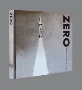
What I love most about book design, and the crafting of exhibition catalogs especially, is that they bring me back to art school, a time when I was constantly learning something new about an artist, an art movement, a time in history. I enjoy doing the early research and then discussing projects with curators, artists, and volume editors. The first project meeting with the curator is often energy-filled, their enthusiasm and passion for the work infectious. I launch into the project excited and charged. A case in point is the catalog ZERO: Countdown to Tomorrow, 1950s–60s for the Guggenheim; I knew very little about this network of artists and their pioneering nature before designing the book.
Yet the most difficult part of design is starting a new project—it can be somewhat torturous. Often the first days are filled with an equal measure of dread and excitement, knowing that there is endless potential and rich material to work with, and hoping that the final product will be a fresh approach, resonate with the right tone, and successfully communicate the subject matter.
I enrolled in art school to study photography and illustration. I stumbled into a graphic design intro course and felt an immediate fit. What engaged me was a strong focus on concept development and the necessity to create purposeful work. I relish the challenge of working within limitations (I liken it to the Iron Chef being given just a few ingredients with which to make a superb meal). The process for me is not an invention but a construction that comes from being resourceful with type, imagery, paper, and ink. I do believe that most of the time, less is more; I gravitate to a minimal approach. When I was in school taking a life drawing class, the instructor observed my overworked sketch and commented, “Well, one of these lines is correct, but these other fifteen are just getting in the way.” That was a lesson learned to not overstate—to let each element stand on its own to be seen and appreciated. Design as I see it is a process where you gradually apply limitations until the desired solution is revealed.
If I were to choose one of the most gratifying projects that I have worked on in the past few years, it would be the catalog for the Society of Arts and Crafts, Boston, on the work of Wendy Maruyama. I recall receiving the RFP on a Friday and spending the weekend researching the artist and her work. I was so excited by the project that I started sketching out ideas well before submitting my proposal, let alone learning that I was being given the project. The exhibition Wendy Maruyama: Executive Order 9066 tells the story of the Japanese-American internment camps during World War II. Executive Order 9066 was the directive signed by President Franklin D. Roosevelt ordering the incarceration of all people of Japanese ancestry who were then residents of the United States. The artist explores issues of ethnicity and identity around the concealment and incarceration of a vast number of individuals.
There were two distinct parts to the exhibition. In the first part, Maruyama replicated individual identification tags worn by the internees in the relocation camps, assembling the recreated paper tags in cascades, each cascade representing the internees at a specific camp.
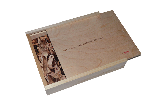
In the second part of the exhibition are boxed works of art with sliding panels. These are constructed of wood and tarpaper, referencing the raw materials of the rustic shelters the internees lived in. These boxes simultaneously reveal and conceal artifacts from the internees’ experiences in the camp. The themes of confinement and concealment are depicted by the box itself, with its sliding lid.
I researched the prospect of using wood and tarpaper for the catalog design. Books using wood for the cover material—such as Bent Ply, published by Princeton Architectural Press—were inspiring examples, but proved costly to replicate. The design epiphany came when I discovered a box with a sliding lid at a craft shop. Housing the catalog within a wooden box reiterates the theme of concealment and mirrors the material properties of the artwork. The barrel-fold cover on the catalog adds another layer of concealment: unfolding the dual pages reveals the book.
We located a company in Maine that could produce the boxes. The numbers on the boxes were hand-stamped, referencing the serial numbers assigned the internees on their ID tags. The stamping, the sheet of tarpaper that lines the box, and its catalog insertion made for a great group effort in production, completed by the curators and a number of volunteers. The catalog received a BoNE award and was selected into the Print Regional Design annual.

